If you think your house colors are up-to-date, 2026 might make you rethink that.
Not because radically new tones appearevoNot only because many color palettes that have defined recent years are beginning to lose their relevance to how we inhabit spaces today, but also because others, softer and more nuanced, are gaining ground almost imperceptibly.
En Chic & Fabric We've been observing this for some time now in real-world projects: clients who no longer ask for "a pretty color," but rather for feelings. Homes that feel welcoming from the first moment, that don't become tiresome over time, and that harmonize well with natural light, textiles, and materials.
Before discussing specific colors, it's important to understand why they're changing. For years, a cold, highly controlled aesthetic dominated, based on bluish grays, stark whites, and sharp contrasts. It worked in its time, but today it feels impersonal. The need now is different: warmer, more human interiors, less visually demanding. And this shift explains the color palettes that will define 2026.
Soft sand and warm beiges
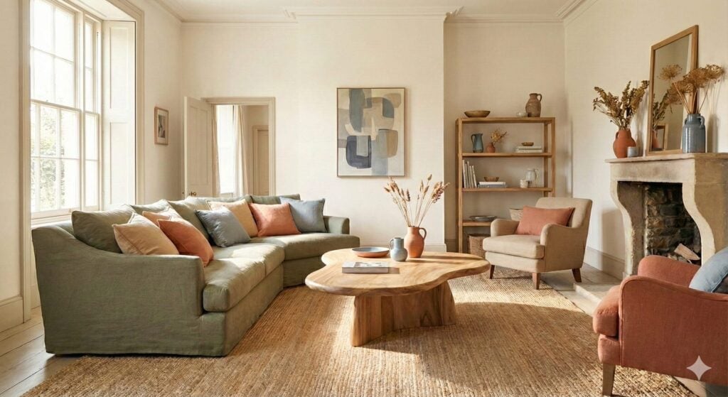
Soft sand is establishing itself as one of the key shades for the coming years. Chic & Fabric We work with it often because it has a very difficult quality to achieve: it brings warmth without darkening and brightness without coldness.
It's not your classic beige, nor is it a default neutral. It's a nuanced tone that works especially well when combined with natural fabrics, such as washed linens or textured cottons, and with light or medium woods. In bedrooms, it creates an immediate sense of relaxation; in common areas, it helps to unify and provide visual continuity without overpowering the other elements.

clay green
Clay green emerges as one of the best allies for those seeking to introduce color without disrupting the calm of a space. It is a restrained, deep, and elegant green that in Chic & Fabric We usually use it as a serene background or in very specific points of the project.
It has the ability to connect the interior with the exterior without appearing rustic. In studies and workspaces, it promotes concentration; in bedrooms, it brings balance. We always recommend using it sparingly and pairing it with warm neutrals and soft textiles to prevent the space from feeling visually closed off.
Soft terracotta
the terracotta evoIt leans towards more muted and sophisticated versions. It's a color that in Chic & Fabric We use it with special care, because when well done it adds character and depth without being imposing.
It works beautifully on accent walls, in entryways, or through handcrafted textiles and ceramics. Combined with natural fibers and sandy tones, it adds a warm and contemporary touch. The key is to avoid excess and pay attention to the lighting, which determines whether the result is elegant or too dense.
Light blue on a gray background
The blue that we'll see gain prominence in 2026 is light, matte, and has a grayish undertone that makes it much more approachable. In projects of Chic & Fabric It is often found in workspaces, long corridors, or accent walls, where it adds depth without darkening the space.
It's a shade that works especially well combined with light woods, natural fabrics, and well-chosen warm lighting. When used judiciously, it elevates a space without being overpowering.
The Pantone Color 2026
Each year, Pantone chooses a color that encapsulates the mood and trends of the moment. The Pantone Color of the Year serves as a reference point in design, fashion, and interior design.
The Pantone Color 2026 encourages us to look to the sky. Cloud Dancer (11-4201) It is an off-white, soft and natural, inspired by the calmness of the clouds.
An excellent base tone to add brightness and warmth to large surfaces, for example, on walls and ceilings.

Shades that lose prominence
As these color palettes gain popularity, others are falling out of favor. Cold gray, so common for years, now feels flat and unwelcoming. Absolute black on large surfaces tends to reduce light and a sense of spaciousness, so it's used much more sparingly. Overly saturated colors, electric blues, and vibrant yellows disrupt the harmony we now seek in interiors.
En Chic & Fabric We're not talking about forbidden colors, but about context. It all depends on the space, the light, and the use, but it's clear that the general trend is moving towards complementary tones, not dominant ones.
Color as part of the project, not as an isolated decision
By 2026, color will no longer be seen as an independent choice. It will be part of a whole: materials, textiles, lighting, and the way we live.
En Chic & Fabric We always approach color from this holistic perspective. We're interested in how it changes throughout the day, how it interacts with fabrics, how it ages, and how it feels with use. That's why the trends that truly endure are those that integrate naturally and provide long-term well-being.
Rather than following a specific palette, it's about building coherent, personal interiors designed to be lived in.